Back to all templatesSimple Card

Simple CardFree
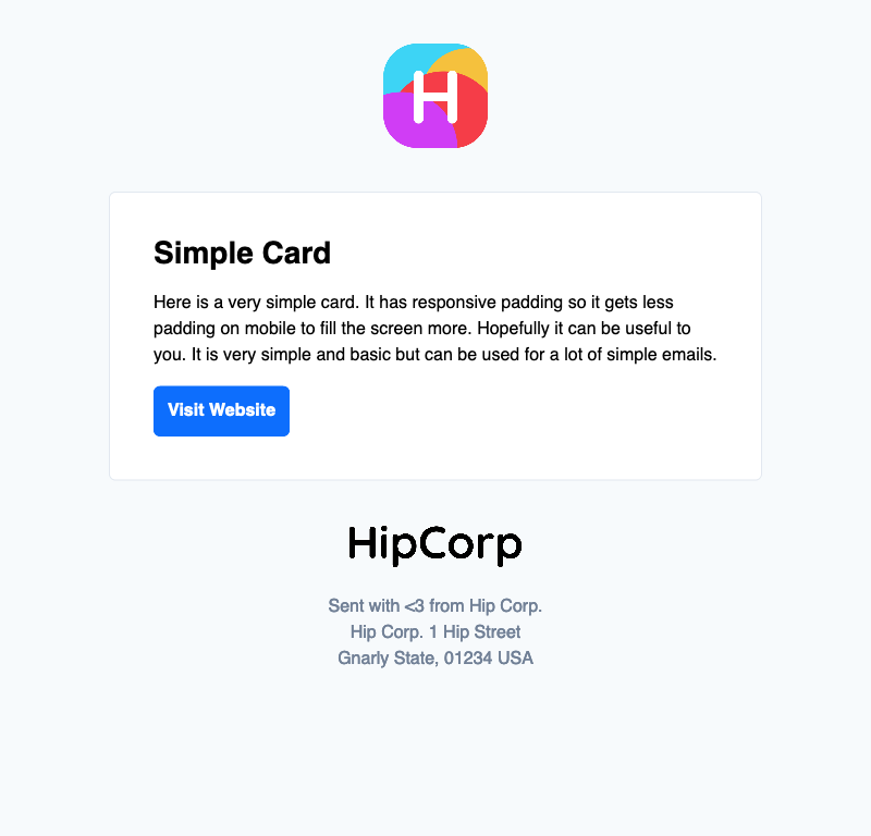
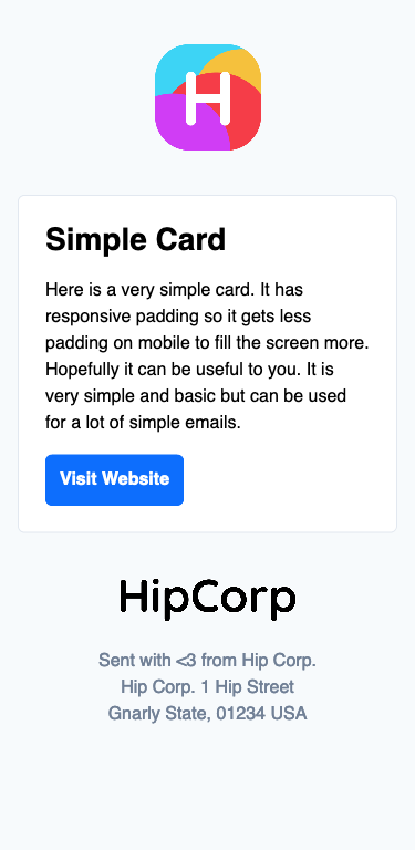
This is a screenshot of the compiled email. To view a live in browser version of the email click the "Live" button.

This is the pre-compiled code. It needs to be compiled via Bootstrap Email to build it for use in emails. You can do so by clicking the "Open in Editor" button, programmatically compile, or use the already compiled version by clicking the "Download Compiled" button.
<body class="bg-light">
  <div class="container">
    <img class="ax-center my-10 w-24" src="https://assets.bootstrapemail.com/logos/light/square.png" />
    <div class="card p-6 p-lg-10 space-y-4">
      <h1 class="h3 fw-700">
        Simple Card
      </h1>
      <p>
        Here is a very simple card. It has responsive padding so it gets less padding on mobile to fill the screen more.
        Hopefully it can be useful to you. It is very simple and basic but can be used for a lot of simple emails.
      </p>
      <a class="btn btn-primary p-3 fw-700" href="https://app.bootstrapemail.com/templates">Visit Website</a>
    </div>
    <img class="ax-center mt-10 w-40" src="https://assets.bootstrapemail.com/logos/light/text.png" />
    <div class="text-muted text-center my-6">
      Sent with <3 from Hip Corp. <br>
      Hip Corp. 1 Hip Street<br>
      Gnarly State, 01234 USA <br>
    </div>
  </div>
</body>
